Wednesday, May 23, 2012

POST 9


EVERYONE: Do a mini research project on a work of art or architecture from the late 20th century.When writing your post, please include a link to an image (or the actual image, if possible) within your post. Including a link or image will help other readers to follow your discussion.
After finding a work of art that captures your interest, you should use scholarly websites or an academic journal online) to learn more about this specific work of art. For example, look for ways that art historians have analyzed or discussed this specific work of art. Or, you may be interested in researching the history about the patronage, creation, or function of the work itself.

FRIDA KAHLO- The Broken Column
 “I paint myself because I am so often alone and because I am the subject I know best.” – Frida Kahlo. 
When Frida was a young child she was part of a horrible bus accident, which left her with lifelong pain and suffering, and she incorporated this into a lot of her works. She also went through a numerous amount of other things that made her render her physiological and physical pain, of these things is included a miscarriage, but she also depicts herself as non-human merged with different things, sometimes she is doubled, or distorted and fragmented.
This painting was done shortly after she went through a surgery on her spine. The column signifies her spinal cord and the opened portion of the chest could be how she feels her body is falling apart, and not holding itself together anymore. Frida is a Hispanic woman, which leaves the viewer wondering why she may have chosen to render a Greek column rather than her own cultures column. In this sense it is a cliché, which almost anyone, can identify right away as a column, which happens to be placed where her spinal “column” would be. The pins and needles that are all over her skin, show how she felt on a consistent basis. I know this for a fact because I was in a car crash and spinal cord injuries leave you feeling like your skin is being stabbed all over the place. Another thing that brings focus into the painting is the bright white cloth that is draped on her lower torso, with pins that go into what we would assume to be her right leg. After the crash she had some sort of deformity in her right leg, and always covered it up with long dresses, and in this sense, we can take it that she is bare on top because she can’t control how she feels on her torso, but she can hide the deformities that haunt her. As well as, she is also covering her womb area, which is another thing she is embarrassed by and chooses to hide this in her painting. The one thing that I’m attracted to is the bonds that hold her together like a corset, it seems to be the only thing that is holding her body together, but I can’t find any articles about why she made this choice. But upon looking at this painting I realized that I was only looking at her since she is the main focus but then I noticed the barren waste land behind her, and what does this stand for. It symbolizes the feeling of aloneness and how she feels like no one knows the pain that she is going through, and there’s no one there to help her out of this pain and misery. The background highlights the vulgarity of her, more so her wound, as the background is more cool colors with her warm colors on her body.
The way that Frida paints, is considered Surrealist, but she said, “that it dealt not with dreams worlds, but rather with her own lived reality”.

sites used:
http://www.pbs.org/weta/fridakahlo/life/index.html
http://www.learner.org/courses/globalart/work/57/index.html
http://www.streetsie.com/spinal-injury-art-frida-kahlo/
Hardin, Terri, "Firda Kahol; A Modern Master", April 1997, New Line Books Limited, Singapore, used 5/22/2012.

Wednesday, May 16, 2012

post 7/8

Option #2: Select one or two works of art from this week’s reading assignment, and analyze if/how these works of art were influenced by Cubism. You will want to mention at least one Cubist work of art, in order to prove your point. End your post by giving your own opinion of Cubism’s influence. What movements in the art world do you think could exist (or could not exist) without Cubism?

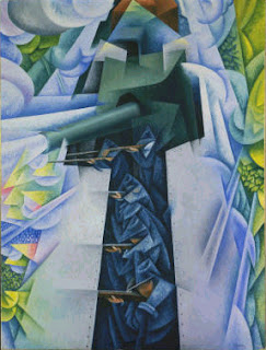
Gino Severini "Armored Train in Action"
      Cubism is a form that Pablo Picasso started in the early 1900's. Picasso was a classically trained Academy student of art, and was rather astonishing at Illusionist painting, but wanted to go against the academy so he did, and he also had the upper hand in the situation as he knew exactly what the Academy wanted, and knew what he wanted to go against. He came up with a term which he uses quite often in his paintings, and after knowing this knowledge you just might find a new found appreciation for his works. The term is "Simultaneity" which is seeing 2 views of a subject matter at the same time, for instance if you look at the faces he paints one side is the profile view and the other side of the face is a different angle on the same face. With this Pablo Picasso went further with his inventive works and started cubism, which its sole purpose was to only go against the Academy, which always seems to be for the very realistic looking paintings that follow accurate measurements, and no being able to see the artists hand in the work.
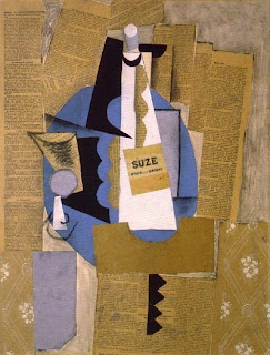
Pablo Picasso "Glass and Bottle of Suze"
     Picasso came up with a specific technique which we now call, collage, but it is the art of taking things and making them into art, such as the painting to the right "Glass and Bottle of Suze", which is made of what seems to be newspaper clippings, and he uses very minimal charcoal to accent a few things, and though we know that this is a flat thing, he juxtaposes a three dimensional view onto the viewer and we can see depth within the art piece.
     Gino Serverini's "Armored Train in Action" is a great example of Futurism, but it is a different form from cutting and pasting like Picasso has done in some ways. Severini's group of artists pulled ideas from cubist art to be Avant Garde, since in order to be avant garde you have to pull from at least one of the aspects of, difference, reference, and deference. Their main focus in their art was to advocate war and revolution, so giving the cubist art a little more Saint Simonian Avant Garde purpose, rather than just having art for art's sake. The subject matter is a lot more noticeable , or identifiable, than the cubist artworks. We can also see the geometric shapes that come from the cubists as well, even the flatness of the painting yet still a bit of depth in it. But still a lot more able to understand than the cubism.
      Cubism's influence in art is a hit of miss, but it definitely opened the door for the more abstract art forms that we see today such as, Dadaism, minimalism, and potentially all the other out there art forms. I do not think that these art forms could ever exist without Cubism. But the more traditional art forms, like illusionist, and realist, maybe even Impressionist art would still be in existence without cubism, one because they had already made a debut before this art movement and people were aware of their existence, but also because the subject matter was more "readily available" for the viewer to know what was going on, and the viewer doesn't have to feel violated, in the sense that the artist is trying to "hide" something from them. But overall, I think that cubism opened the doors for artists everywhere to truly explore their true potential.


Wednesday, May 2, 2012

POST 6


Option #2: Use your knowledge of Primitivism to analyze a painting by Henri Matisse, "Blue Nude: Souvenir at Biskra" (1907). First, consider how this female nude is different from other depictions of female nude that exist in Western art. Why is this work avant-garde? Using what you know from reading p. 174-177 ("Challenge of the Avant-Garde"), how can we interpret this painting as being influenced by primitivist ideas? Feel free to mention if/how this painting reminds you of any of Gauguin’s works. (Please note that Matisse is a Fauvist painter from the early 20th century. Although Matisse made this painting a few years after Gauguin’s death, we can still pinpoint some connections between these two artists via Primitivism.)


Henri Matisse, "Blue Nude: Sovenir at Biskra" (1907) 
The female nude that is depicted in Henri Matisse’s “Blue Nude: souvenir at Biskra” is different from female nudes in Western art, because of many reasons. First she does not seem to be in a very relaxing pose though she is laying down, her feet look scrunched in to her body, and her left arm is pulled up above her head in a very unnatural pose. Secondly, she is very muscular comparative to normal Western female nudes, she has very toned arms, and torso, as well as her posterior isn’t very “not proportioned right”. Lastly she does not seem to have very “feminine” hair, it seems to be rather short and her face masculine. This work however is Avant-Garde because of the new “primitive” art movement, as we talk more about the term Avant-Garde, it seems to mean the new art form that did not exist before its time. 

Primitive art releases itself from the post-impressionists which paid a lot of attention to color and form and lighting, with strict attention to their surroundings. With Primitive art it pulls away from all of these things and looks back to the Egyptian and Greek art forms, which are more outlined subjects and solid block color backgrounds. 

This painting is influenced by primitive art because of, how she does not resemble traditional female nudes, and she is boldly outlined. As we look at the painting we see the bold strokes of colors not only on the woman but in the background. Let us talk about the woman first, she is a flat skin color in nature, with strokes of blue that try to show where the shadows on her body lay, this differs from previous art forms of the century because artists would of used other shades of nude to help form shadows and contours of her body, the blue color is not necessarily at question here, as impressionists would of most likely used that color too, but the primitive form only uses other colors to shadow the body form, and no other shades of nude. As we look at the background we can see that she is surrounded by bushes and ferns, but that is the image that out brain puts there, they are actually wide strokes of the artists brush that takes the shape of these things. 
Gauguin, "self-portrait"

Matisse’s painting resembles Gauguin’s works such as Gauguin’s, “self Portrait” we see the bold outlining again. As well as the “flowers” that are in the foreground only resemble flowers that our minds can put together. Another thing that we can compare from this specific painting is the apples in the back ground. If we pay attention to the red apple we see the shaded area of the apple is a light baby blue, showing that even though it is a red apple you do not have to use other shades of red to portray a shade and contour of the apple, and if we look at the background behind the green apple we see the shade on the, what seem to be a wall, which is baby blue again. Finally is the human form, unless Gauguin is morbidly obese and his shoulders rather rounded instead of broad, his attention to human form in his painting is almost thrown out the window, but we still get the idea that it’s a man, not an animal or alien of some sort.
 

Wednesday, April 25, 2012

POST #5

Option #1: Discuss the concept of modernity in Caillebotte’s work. Do you think that Caillebotte’s paintings are a celebration and/or a critique of modern life? When writing your response, you may decide to discuss the theme of isolation in relation to modernity. Analyze at least one painting by Caillebotte (from our Challenge of the A-G chapter or lecture) that helps to support your discussion.

Modernity as defined by the online dictionary, means something that is modern, which I feel fit Caollebotte's work very well. He painted many things of Urban landscapes, as well as rural landscapes of modern life Paris. His paintings have been said to have connection with the Impressionists, which I can see in some works, because of the way he paints and leaves his hand on the paintings and the harsh incline of the ground. Although, unlike the Impressionists who seemed to celebrate life, and studied how the light fell onto their subject matter, I believe Caillebotte did more of a critique on modern life. He shows the more real, everyday things that were going on, and wasn't necessarily afraid of hiding every detail "horrid" or not. looking back at my Post #4 where I talk about how Impressionists were a "forgetful" art.

Le Pont de l’Europe
Jour de pluie a' Paris
One thing that I found interesting was a very subtle comparison of Jour de pluie a' Paris and his earlier painting of Le Pont de l’Europe. in which the main subject matter is of a man and a woman holding an umbrella, after paying close attention these people almost seem to be the same people in the other painting. But going along with this idea of isolation in relation to modernity, I can see it with both of these paintings, in both the paintings, there is NO connection between the subject matter people and everyone else around them. It is this feeling of loneliness, where no one is paying attention to any one or anything else besides themselves, except for the subject matter people which, even then though they are the closest people in the paintings, meaning they are walking together, no one else seems to be that close to another person.

Going along with the theme of isolation, I want to focus and discuss it with his work Le Pont de l'Europe. There's a dog walking into the painting on the bottom right, it seems to not have an owner, next to the dog there is a lone man. This man is slouched over a rail, contemplating something and doesn't seem very interesting at all. Then we see the man and the woman who seem to be enjoying each others company and going on a pleasant little stroll over the bridge. Then, just past the couple we see a few more men slouching over the rail, and what seems to be an old man taking a walk. Another thing that I find interesting about his painting is how the scenery around the people in the front is very detailed, then as you progress to the background it loses it's details but you can still make out what it is.

But moving into his later painting with the same couple in it, we see how the couple is still enjoying each others presence, and everyone else seems to be still isolated. could this be Caillebotte showing isolation in the modern life, or could this be him showing how life is more bearable in modern life with companion ship. I feel that it may be both, but more so the latter one, the only true way of knowing is to ask him personally.

Wednesday, April 18, 2012

POST 4

Option #2: In the Challange of the Avant Garde book, Paul Wood writes that Impressionism is a "forgetful" art (p. 121). Why is Impressionism "forgetful"? Feel free to disscuss subject matter for specific works of art (either in the Cahllange of A-G book or Stokstad textbook) to support your point. Do you think that Impressionism is "forgetful" in relation to artistic technique or tradition? why or why not?

Paul Wood in "The Challange of the Avant Garde' (page 121) basically says, Impressionism is a "forgetful" art. What he means by this is not that people forget about the art, much like I thought this meant at first, but rather the Impressionistic painters are painting other things than what was really going on. For example there was a big civil war in France and many things were left in ruins, but instead of painting all the ruins and dwendeling on the horrific things in reality, they painted the ruins off to the side or not at all and almost made them look like they did not even exist. They almost were much like Escapist pieces, if you would rather say that. The artists looked forward into the future rather then thinking about what was going on, as the old saying goes "out of sight, out of mind", bringing me back to the "forgetful" phrase that Wood uses.
One artist I want to focus on is Monet, we talked about him in a couple lectures leading up to this post, but Monet left France during the war, and came back shortly after the war ended, before this all happened he painted the streets with people in them, and focused on how the light fell onto his subject matter. Monet kept this mindset when he came back to France, but no longer wanted to just paint everything, because the things he saw were disturbing.
The painting that I want to focus on is one that another painter at the time painted a different way around the same time, this painting is Monet's "The Tuileries" and compare it to Meissonier's "the ruins of Tuileries". In Monet's painting he puts the Tuileries off to the left and we can only see the un-harmed front portion of the building and he focuses his painting on the extravagent garden scecnery the surrounds this place, and there's a few people and life looks great and dandy, just like he remembered it before the war. Meissonier on the other hand, paints a picture from the inside of the Tuileries and shows you the rubble (which takes up a good third of the bottom of the painting), but to kind of emphasis how the impressionist painters of this time are "looking to the future" Meissonier paints the little statue of Victory just off the ledge of the balcony in the background, showing hope and aspiration, that though all this place is destryoed there is still a brighter tomorrow, almost.
The question is asked "Do you think that Impressionism is "forgetful" in relation to artistic technique or tradition? why or why not?" I do not think that Impressionism is "forgetful" in its relation to the artistic technique, BUT I do feel that it may be "forgetful" in it's relation to its tradition. The paintings still have that split second quality to them, you can see the hand of the artist, with the study of light and color still in play. But the tradition of Impressionism is to paint what you see in front of you, and not cover things up that you dont feel are "good" enough. I feel that a lot of the impressionist painters are all of a sudden painting what they think the viewers will like, which almost reads to me very UN Avant Garde. I take the Saint Simonian point of view when I think of Avant Garde and say that art is political, especially right after a war. It is not healthy for people to just over look the past, because if you don't study history then you're doomed to repeat it, so why hide ALL of the rubble? why shelter people from the things that are going on around them. It's ok to embrace the fact of things that just happened, as long as you are doing it in a healthy manner. So I think that Impressionism at this time is still following the artistic techniques, but is "forgetful" of its tradition, because it is forgeting what's going on around it.

Wednesday, April 11, 2012

POST 3

Write a formal analysis on one Impressionist painting.* What is your reaction to this work of art, based on the formal elements that are presented? You should consider some formal elements like color, line, composition, style, scale, etc. Please remember that the subject matter (i.e. what is “happening” in the narrative scene) does not constitute a formal element.
Be sure to just pick one or two overall reactions as your thesis statement. Please select your work of art from Chapter 30 of our Stokstad textbook. When appropriate, be sure to use some of the art historical terms that were introduced in the textbook and during lecture. Please be aware that there isn’t a “right” or “ wrong” reaction to a work of art. Instead, you will be graded on how well you support your reaction by analyzing the formal elements of the piece.

Gustave Caillebotte "Paris Street, Rainy Day" 1877, Oil on Canvas


            Gustave Caillebotte was a post-impressionistic painter. The street is tilted at a drastic angle, the hand of the artist is noticable (but not as much as other artists of the impressionism movement), and the subject matter is outside with a study of light and colors. This painting captures the wonderful street life in "modern day"Paris of the time. Caillebotte like other artists focused on capturing the outside subject matters and focused on light and how the different colors would look like under the different lighting depending on the time of day and season, and because of this it wasn't uncommon for artists to put the type of light they were working with in the name of their painting. In this case Caillebotte was painting during a rainy day.
             The street being tilted at a drastic angle is from the Japanese wood block prints, which came from the open trade agreement, and the exchange of art between culture. After the open trade agreement, european artists began to take pieces of these new paintings and incorporate them into their works as well. In this painting the street tilts up at a semi-unrealistic, as if this were to be on a hill or something. In fact this location is flat, the painting is taken at rue de Turin near its intersection with the rue de Moscou, which is north of the Saint-Lazare train station.
      Another aspect of this painting is Caillebotte is his infatuation with Haussmann who was modernizing the Paris street's, we can see evidence of the transformation in Paris, by looking at the man facing us in the foreground's umbrella, if you look just past the umbrella on the left side you can make out a scaffolding rig, which would most likely be Hausmann working. 
      Aside from the people being dressed in modern day 19th century clothing, we notice that this is modern day 19th centruy Paris because of the widened streets and the remodeled buildings. Yet there's still one more important key fact about this painting that shows the modernization of this painting, it's the fact that it resembles a photograph. On the right foreground you can see the back of a man but is chopped in half as if this were a flash shot from a camera. The life of the paint grows so much from cutting the man on that side of the painting, it's as if the viewer is the one who is looking at this image with their own eyes, instead of just looking at a painting. 
        The Impressionistic painters left their "hand" in the details of the painting, some examples would be impasto strokes, or glazes or heavy strokes. Caillebotte didn't typically use these "traditional" impressionistic painting styles, but he did like to use bold brush strokes to help create texture, such as the very believable paved street.
         The movement of his brush strokes and use of colors, make me feel as if I were there with him as he looked at the street and saw this entire scene happening, the hustling and bustling of the people, huddling under their umbrella's to avoid the slight rain so they dont get their wonderful clothes wet. The part that I love the most though is his slight attention to details, not just in the subject matter, but the wonderful little details such as the scaffolding in the background, that upon first glance isn't seen but when appreciating and looking at the overall picture is. These are the little things that really bring the story of the picture to life and more realistic to me.

Wednesday, April 4, 2012

POST 2


Option #2: As we learned in the case study, the art critic Marie-Camille de G. (who was a Saint-Simonian) wanted “an art that laid bare social oppression” and could “transmit a vision of the utopian socialist future.” Select a work of art from this week’s reading in the textbook (either Stokstad or The Challenge of the Avant-Garde), and discuss how this work of art fits or diverges with Marie-Camille’s ideas. If the work diverges from Marie-Camille’s ideas, how could the painting be modified (in terms of subject matter) to better fit with what Marie-Camille wanted?

Marie-Camille de G. wanted art to invoke the bourgeoise to the facts of the lower class, but she was a conservatist. Which relates to one of the assumptions that we should never make, just because someone is a revolutionist or reactionary, doesn't mean the art they want or like is going to be crazy out there and in your face. Which Marie-Camille de G.was a reactionist, but like things to be very subtle and influence people in a drastic way, without totally offending them. Marie-Camille used art for her politcal points, one piece that made a big impact that she choose to put in a salon, was called "A Burial at Ornana" a painting by Gustave Courbet in 1849.
This was a time period that photography had begun, and started a new art movement which we call, Realism. Realism is a form in which artists depict the world around them, litterally, so there is no mythological creatures or gods, or anything that isn't actually there. Gustave Courbet's painting depicts a burial, obivously, at Ornans. The burial is on a families land and the person being buried is obviously someone that all the lower class people know very well.

Below I have hopefully *crosses fingers that my ipad did what I want it to do for once* attached a picture so that you can see what I'm talking about.

Gustave led the realist movement, and the Burial painting is of the burial of his grand uncle. The painting recieved a ton of praises and a lot of fierce comments. The Burial brought a on roar and applause from Marie-Camille, because the painting had made itself known in the art history, it was almost like a dity person crashing a nice cozy little party. Subtle but powerful just the way Marie-Camille wanted it.
Though I greatly appreciate the painting that Marie-Camille has choosen I feel that there is another painting that would do the same thing, though the painting that I choose was painted 20 ish years later, so I had to find another one, because, another assumption that we can never make is everyone will see the painting the same way that you do. Kind of like there's always two sides to the story, I feel that there could of been another painting that would of gotten the job done.
But from the paintings in our book sections I couldn't find any that appealed to me, after looking online though I found a painting by Gustave Caborte, which was a self-portait, titled "Desperate Man". It's a painting of a man who has a look of desperation and franticness about him, and his eyes pierce the eyes of the viewer. His clothes aren't of the working class, but they are also not of the bourgeoise, it's more of what an artist would wear of the time. I feel that the painting almost forces the viewer to feel what he is feeling, and though the Burial painting is great, a lot of the people in the painting do not pull you into it, they are looking either at the burial that is happening or looking off into the distance. I can see why Marie-Camille did not choose this painting though, it's because she wouldn't of liked the drastic intensity that is forced onto the viewer, so in order to change the painting for her pleasure I would change the direction that the man is looking, so that he isn't so drastically forcing his gaze and his emotions onto the viewer. Also instead of having the man take up the entire painting I would have the man be in a room, so that we could see where is located, giving the viewer a little more knowledge of what is this man so frantic and crazed about.